« Trouble with parcels part II | Main | writing with paint »
April 13, 2008
Bankfield Mill writ large
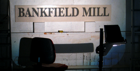
First find a nice flat long thin bit of wood, say an old 1930s wardrobe door, give it four coats of primer and two coats of gloss.
Then pick your typeface and I use the word advisedly. Computing has given us many exciting new words, but its misconstrued a few along the way. Maybe it was just to save space on the menu bar, I dont know, but now people always call a typeface a font, when its not.
A font is the collective noun for all the bits that go to make up one size and style of a typeface. One typeface can have many fonts: bold, italic, condensed, 10pt, 11pt, 12pt. Helvetica is a typeface, Helvetica 24pt, extra bold condensed is a font. But I digress.
Choose your typeface.

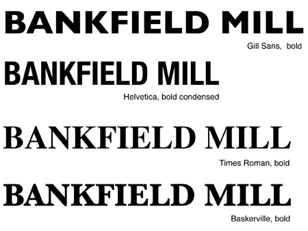
Gill Sans, though elegant was too long for the sign, Helvetica, bold condensed fitted the panel but was too modern for a nineteenth century mill. Times Roman, I felt, was a bit formal. So I went for Baskerville, which was designed in 1757, by Mr Baskerville himself, which is appropriate for a building built in 1826.
I laid it out in Adobe Illustrator, set the size and spacing or, as Mr Jones would say: kerning, because he knows about these things then I projected it onto the panel and drew round the letters.


Time was I did this sort of thing by hand, enlarging each letter by eye and arranging them on the panel.

But that takes ages. Why keep a dog and bark yourself?
Posted by john at April 13, 2008 10:42 AM
Comments
Ooooh, good choice.
Posted by: Flossie at April 13, 2008 03:37 PM