« Art Bollocks | Main | A Girl Sewing »
April 15, 2008
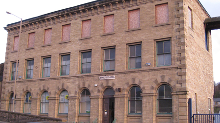
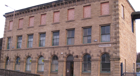
the nameplate
I originally thought the sign should go above the front door:

I feel the Post Office and delivery people need as much help as possible.
But, the size of 1930's wardrobes being what they are, I think it looks better set to the right of the building:

more like a street sign.
Posted by john at April 15, 2008 08:59 PM
Comments
I think you're right, it looks better there, and it's more likely that the delivery men will see it. Let us hope that they do.
Posted by: Daphne at April 16, 2008 10:01 AM